
“How wonderful yellow is. It stands for the sun.” ~Vincent Van Gogh
When I see yellow I am reminded of spring and fall. Of the daffodils and sunflowers. I love the cheery face of yellow in spring, and the warm yellow connection to the sun in fall.
They say that we react to yellow almost instantaneously. We either like it or hate the hue of yellow we see. Many people don’t like yellow painted on their walls. I love a buttery yellow to add more light. And it is tricky when wearing yellow since some hues can make you look pale or even sickly. Pastel yellow is a great color for me.
So let’s explore a bit about the color yellow…..
The word “yellow” comes from the Old English geolu, or geolwe.
Yellow is said to produce a warming effect, makes us feel cheerful, stimulates our mental activity, and generates energy.

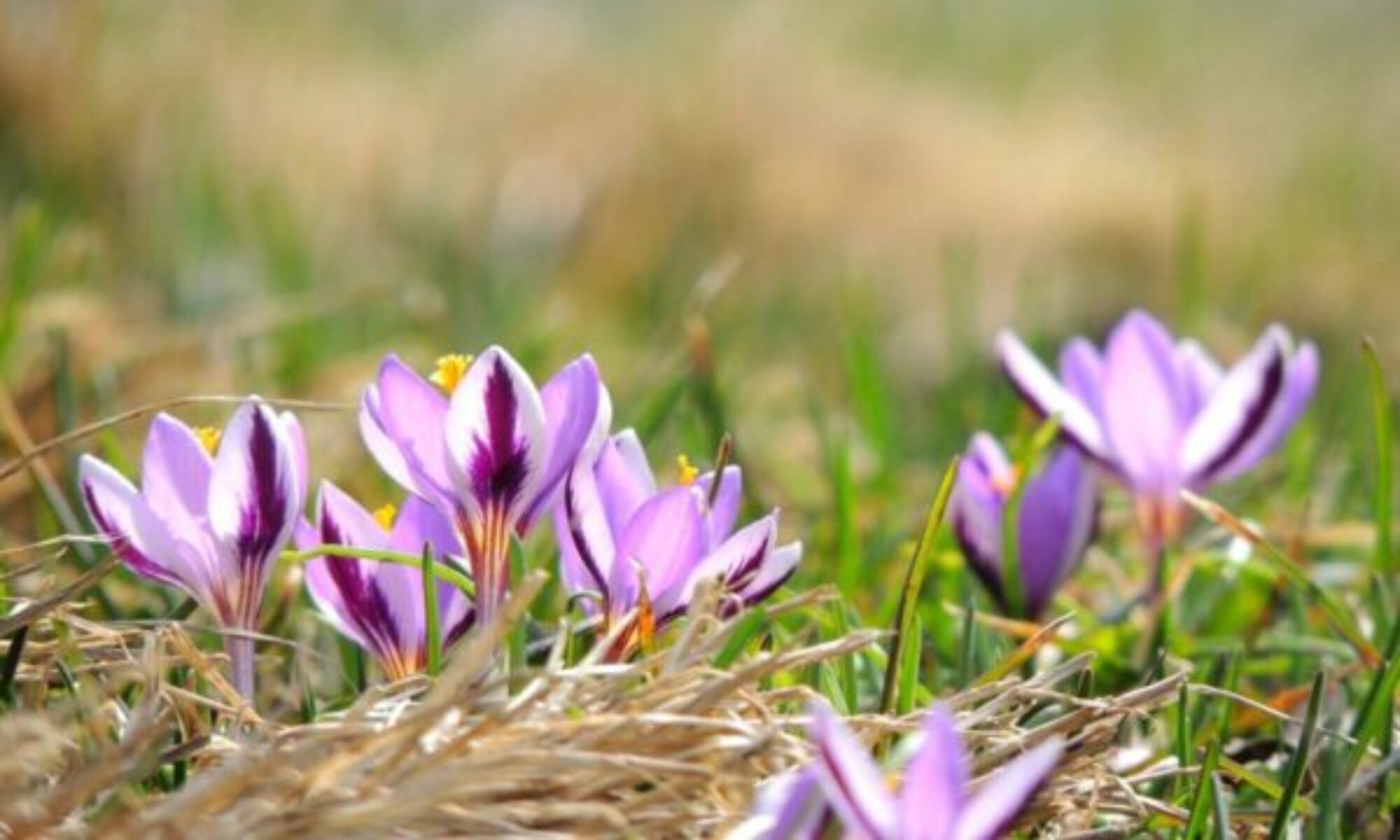
During this week of the #the100dayproject, yellow will be front and center. Perfect for spring as daffodils and crocus start to sprout, I hope soon. It will be interesting to highlight the different hues and see the subtle differences in the yellows I have on hand.

Various Meanings and History
Yellow is used to evoke pleasant feelings and encourages communication. Yellow is the color of sunshine and is therefore associated with intellect, optimism and enlightenment.
Use yellow around your office or home to help clear your mind, improve memory and decision making.
If yellow is your favorite color you are a powerful thinker allowing you to overcome great obstacles. You enjoy the finer things in life especially art. You love to search for new ideas.
When yellow is overused it is said to have a disturbing effect. For instance, they have found that babies cry more in yellow rooms.
In the English language, yellow has traditionally been associated with jaundice and cowardice.
The Chinese hold the color yellow in high esteem more than anywhere else in the world. In China it was the color of emperors during both the Ming and Qing dynasty. The legendary first emperor of China was known as the Yellow Emperor or Huangdi. Members of the imperial family of China at that time were the only ones allowed to display the color yellow.

Fun Facts
A yellow flag means quarantine.
Yellow is very effective for attracting attention. It should be used to highlight the most important elements of your design.
Bright, pure yellow is an attention getter and the combination of yellow and black evokes a warning. These are some of the reason in the US, taxicabs and school buses are painted yellow and black.
The message you send by driving a yellow vehicle is that you are joyful and young-at-heart. But if your car is a Yellow Gold you give an impression of intelligence, warmth and comfort.
Yellow is a color used to denote “caution” which is why it is the second light on traffic lights.
Wear yellow to appear cheerful and uplifting.
The telephone directory was printed every year on yellow paper and thus became known as the “yellow pages”.

Hues
Dull (dingy) yellow represents caution, decay, sickness, and jealousy.
Light yellow is associated with intellect, freshness, and joy.
Gold stands for power. Shades of golden yellow offer a promise of a positive future.

Yellow In the Garden
Yellow is considered a warm color in landscape design. In the garden it has a stimulating effect. Yellow flowers pop in the landscape making a large garden appear a bit smaller or cozier. Yellow’s complimentary color in the garden is purple. A perfect combo.

I loved putting displays of yellow throughout the garden and seasons to draw the eye around. Groups of yellow daffs scattered throughout my former large meadow connected the entire area. A beautiful forsythia in a prominent spot can make a bold statement. I miss mine. After a long winter of gray, white and brown, yellow is a great color to see that finally convinces me spring is here.

As we just had another 6 inches of snow in a whopper storm this weekend, I knew I needed some flowers. So when my husband went shopping, I asked him to bring me some yellow flowers. I was sure he would bring me daffodils. And wasn’t I surprised to see yellow tulips instead. Aren’t they gorgeous. Love the color.

I couldn’t think of a more perfect vase then another favorite Belleek. With this vase, I am linking in to the wonderful meme, In A Vase On Monday, at Rambling in the Garden.
All the pictures shared in this post were taken with my Nikon Coolpix or iPhone camera, and manipulated on my iPhone using the apps, Pixlr and Prisma. The collages were created with a variety of apps 10 years ago that are no longer available. You can follow my progress with #the100dayproject in my Instagram and Facebook feed.
All original content is copyrighted and the sole property of Donna Donabella @ Gardens Eye View, 2010-2022. Any reprints or use of content or photos is by permission only.
Yellow flowers in spring announce the season. I didn’t plant tulips this year. Might have to add some to my grocery basket this week. Take care.
Hoping a few of my dwarf tulips come up. I recommend grocery flowers more and more these days. We need that color and eye candy.
A very interesting post with gorgeous images – all the sunny flowers made me smile. I love yellow. Hope you’re feeling better. Enjoy your tulips 🙂
Thanks Annette. Yellow is making me smile as the snow melts.
So full of talent, and you’ve chosen the best time of the year to share your delight in yellow. I love yellow and before my present car had a bright yellow one. I could always find it even in a chock full carpark!
Oh I bet you could easily find that yellow car. Glad you enjoyed the post.
Yellow (along with blue and green) has always been one of my favorite colors. I grew up in a yellow house, which might be a factor in my appreciation for the color. I’m once again impressed by your collection of “fun facts” about the color, although I have to wonder how scientific the study showing that babies cry more in a room that color was 😉
Yes and what hue of yellow those babies were subjected to. I grew up in a yellow house too and loved it.
Thank you for this little blast of sunshine on a cloudy day. I especially liked your first collage, with the yellows all overlapping each other.
You are most welcome. I liked making that collage.
Another really interesting post about colour, Doona, and those collages looked amazing. The arty image of the forsythia is particularly striking
So glad you enjoyed the post Cathy. I did really enjoy making those collages.
I love yellow, the sunnier the better, although pale lemon is lovely, too. I painted my dining room primrose yellow. It feels bright even on a gray day. 🙂
I love painting walls yellow. Makes me cheerful.
Such interesting observations, Donna. I enjoy just about every shade of yellow, including unusual ones like chartreuse and mustard. Your collages are awesome!
So many people have told us – I like your yellow car!
That is nice. Many yellows here are not usually pleasing for cars. I wish they were.